Viewer

The Viewer screen displays the data sent to and from Arundo Edge. This includes:
- Data received from industrial control systems
- Data received from simulators
- Data sent to cloud environments
- Calculated outputs for compute blocks
- Calculated outputs for machine learning models
Use the Viewer screen to verify that Arundo Edge is receiving and sending data successfully.
Getting There
Select Viewer on the sidebar.
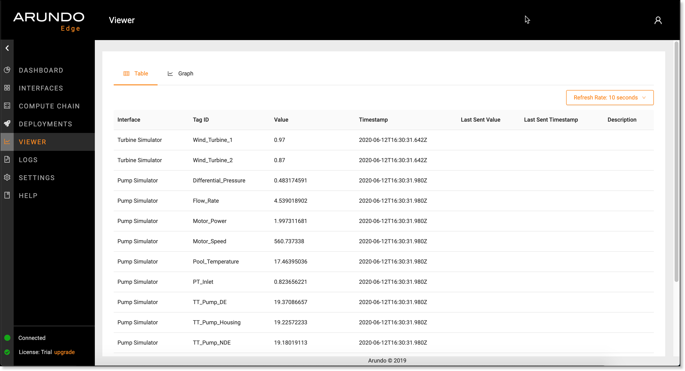
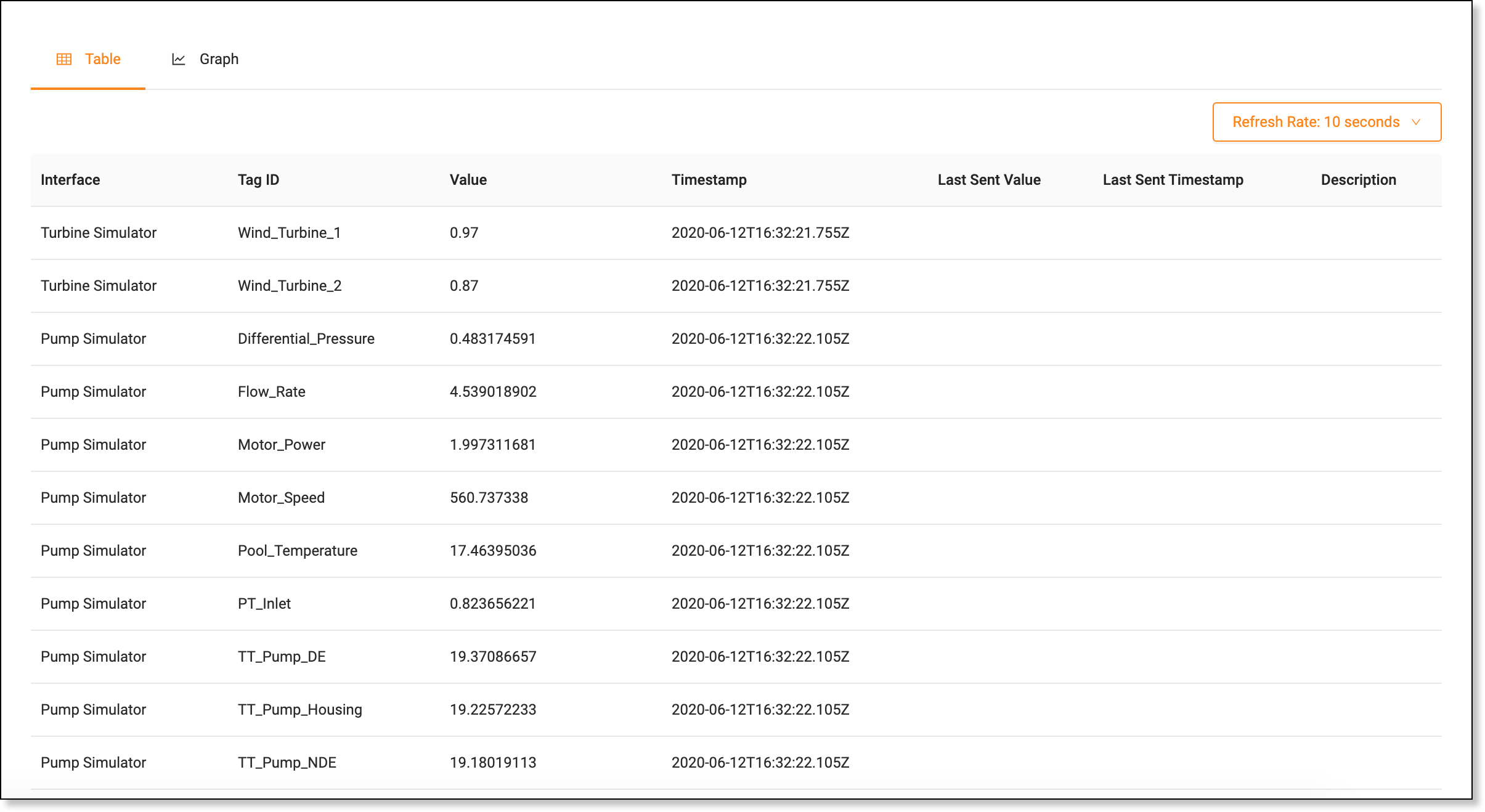
Table Tab
The Table tab displays a list of the latest tag values. This lets you see a complete list of tags from all data sources.
Tip
Adjust the Refresh Rate above the table to change the interval at which to aggregate data.
Graph Tab
The Graph tab displays visualizations of the latest tag values.
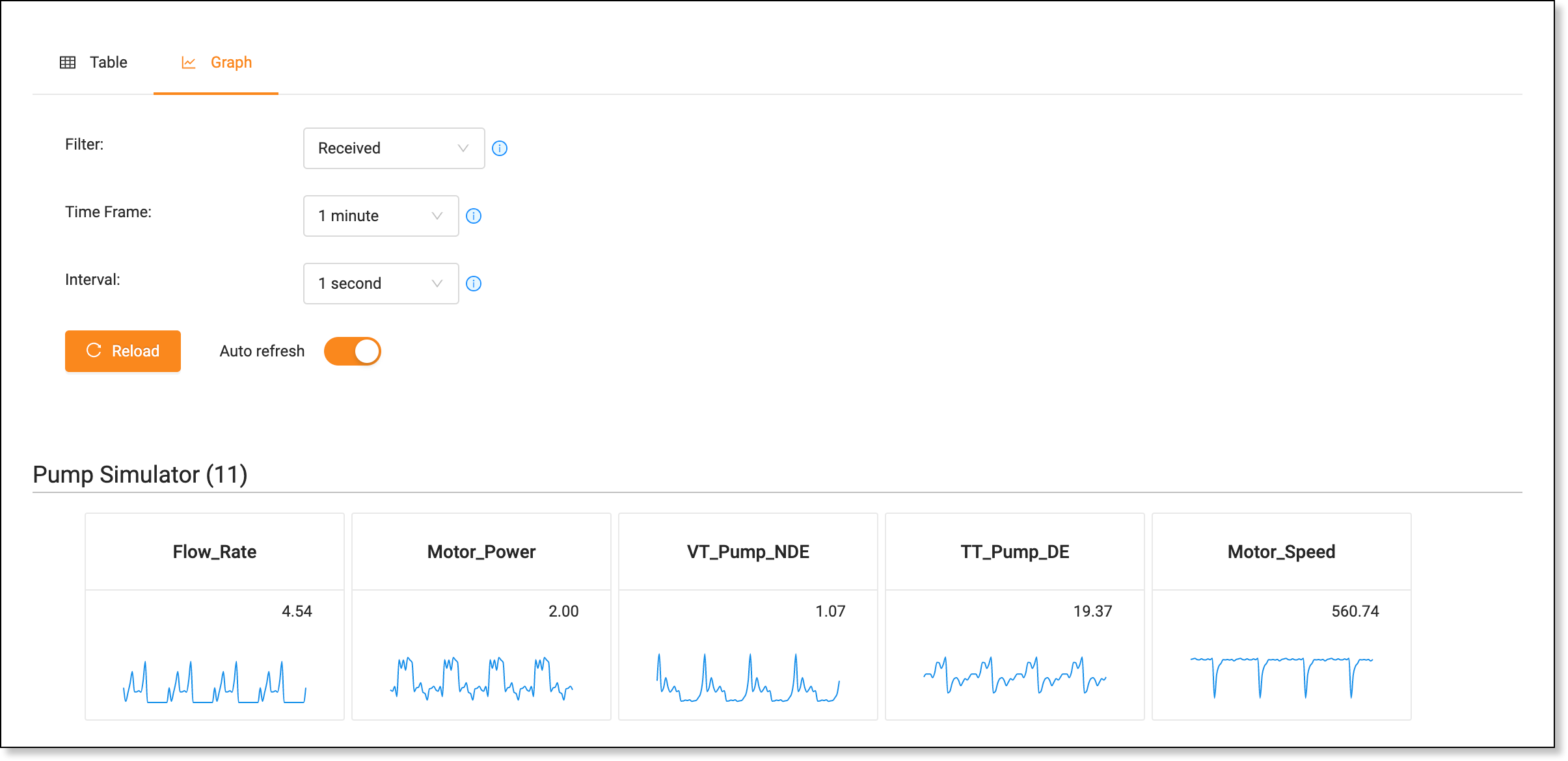
Controls
The Controls panel displays options to change the visualizations shown.
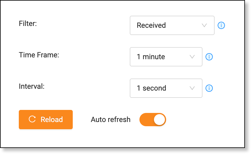
The following options are available:
Controls the type of data shown in the graphs:
- Select Received to display data received from an industrial control system or simulator.
- Select Local to display data received that hasn't been sent to a cloud environment.
- Select Sent to Cloud to display data sent to a cloud environment.
Tip
- If you don't have an OPC UA, Modbus, Sequence, or Simulator interface defined, you won't see any data when you select Received.
- If you don't have a Cloud interface defined, you won't see any data when you select Sent to Cloud.
Time frame for which to display data.
Interval at which to aggregate data during the specified time frame.
Tip
If you select "30-minutes" in Time Frame and "1 minute" in Interval, you will see data for the last 30 minutes with an aggregated point every minute, resulting in 30 data points.
Select to stream data continuously into the graphs at the specified Interval. If you disable Auto refresh, you must click Reload after you change the Filter, Time Frame, or Interval.
Graphs
The graphs display visualizations of data grouped by interface, compute block, and model. Each graph displays data for the specified Time Frame, with the latest value shown in the top right corner.
Example
The following example is a visualization for the Motor_Power tag. The graph refreshes automatically and the latest value displays in the top right corner.
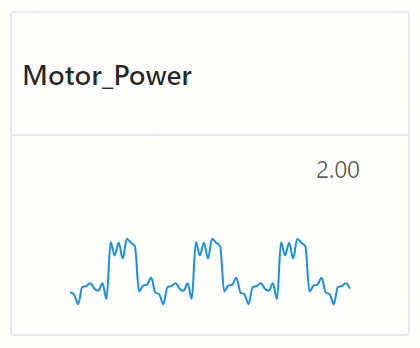
To see values at specific points, move your mouse over the point of interest.
Viewing Specific Data
- Select Viewer on the sidebar.
- Open the Graph tab.
-
Select a Filter:
- Select Received to display data received from an industrial control system or simulator.
- Select Local to display data received that hasn't been sent to a cloud environment.
- Select Sent to Cloud to display data sent to a cloud environment.
-
Select the Time Frame for which to view data.
-
Select the Interval at which to aggregate data during the specified time frame.
Example
If you select "30 minutes" in Time Frame and "1 minute" in Interval, you will see data for the last 30 minutes with an aggregated point every minute, resulting in 30 data points.
-
If Auto refresh is disabled, click Reload to display the desired data.